The project originated as a modification of Barricada, a typeface by Elí Castellanos distributed by Sudtipos, which was already being used across the brand’s communication.
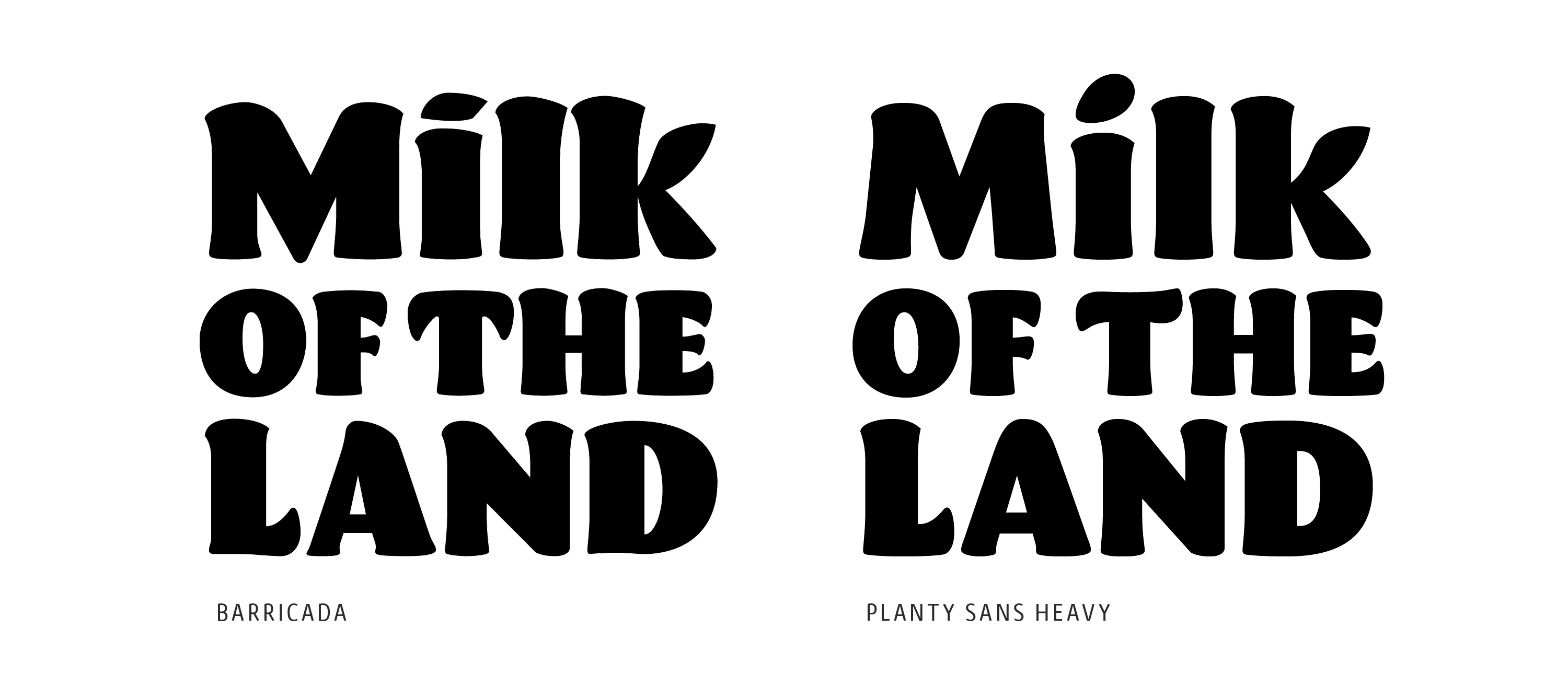
Our role focused on creating a shared visual language between the Silk logo and its companion typeface—one that speaks to the brand’s legacy in plant-based milks while reinforcing a sense of silkiness.
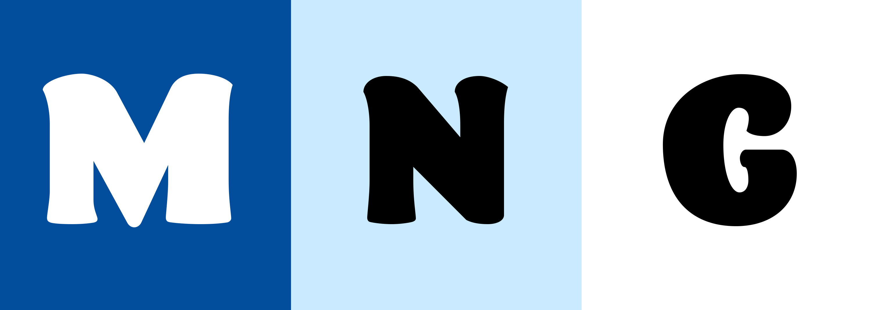
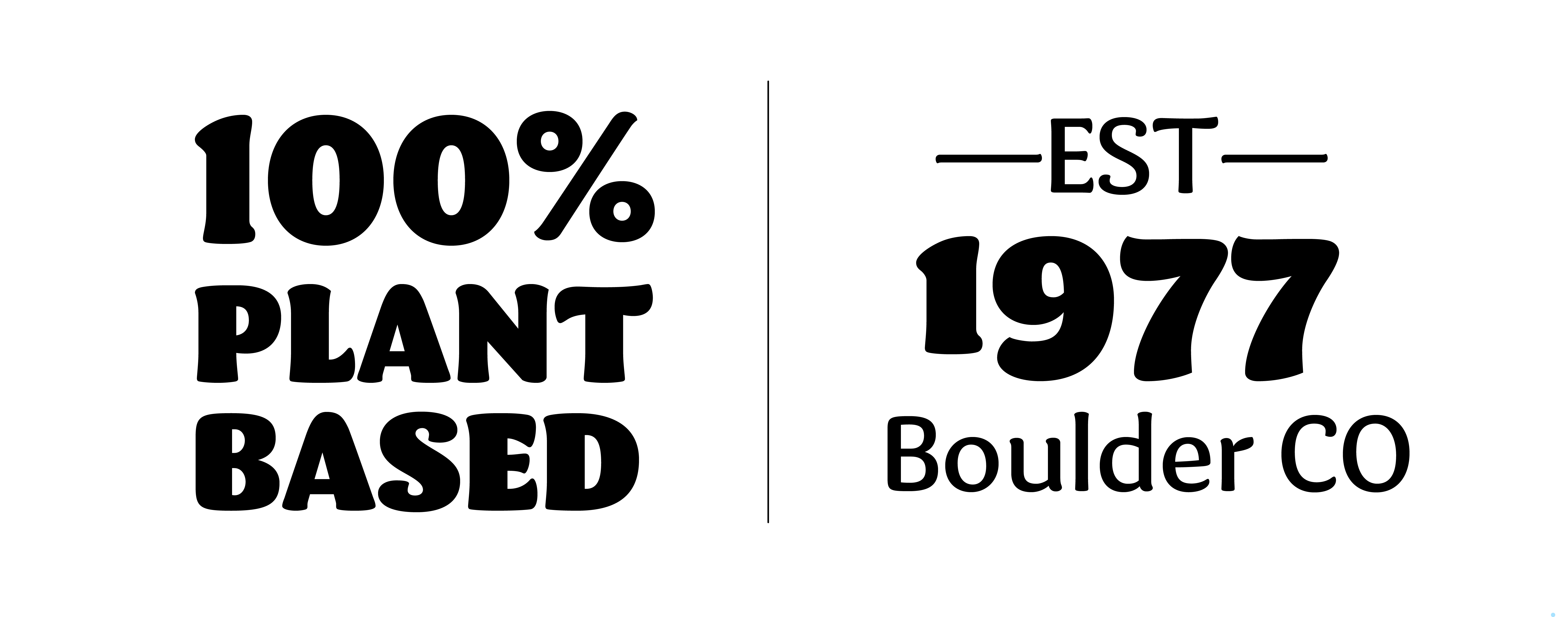
To achieve this, we refined the overall shapes and redesigned key letters and symbols to convey a more plant-based, approachable character.
In addition, two new weights were developed to build a flexible weight system that could adapt to the different levels of brand communication. This process was carried out in close synergy with the logo proposal.
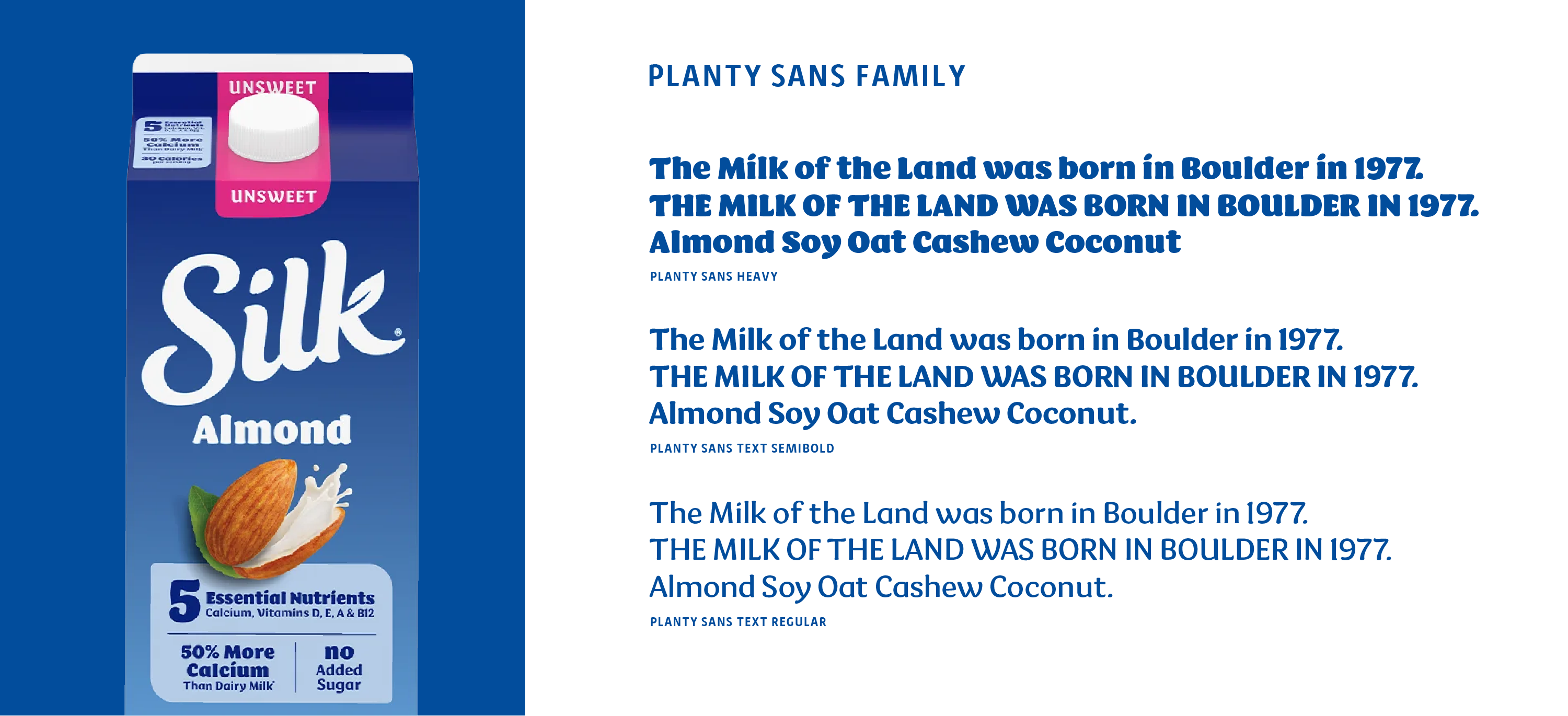
Planty Sans ultimately became a key element of Silk’s visual identity, strengthening the connection between typography and brand expression while offering a flexible, contemporary system designed to grow with the brand.